Tips for Creating Enticing Call-to-Action Buttons

What is a CTA?
CTA is an acronym for "call to action," and it encourages your audience to do something. CTAs can help businesses convert visitors into leads and can drive several different actions depending on the goal of the content.
The design or copy of CTAs is what guides you through the signup process. Without these buttons, you'd probably use fewer websites and apps than you do now, but they're captivating and entice the viewer to click on them.
Actions
There are several different actions that a CTA can have the audience carry out:
- Subscribe. This CTA invites visitors to receive email or text updates from the company and is commonly used in company blogs when a business wants to develop readership. These CTAs do not commit a person to a purchase.
- Get Started. This call-to-action can drive a variety of behaviors, including having visitors sign up for a free trial or a specific experience.
- Sign Up. This CTA might call the audience to sign up for an online course or webinar, an event, a free trial, or even a software product. This really depends on the context of the CTA on the website or ad.
- Learn More. If you want to give your customers a little more information to sway them into buying something, this is the CTA to use.
- Try for Free. Nearly every website offers free trials today (where applicable), and all of them are using this type of CTA, which allows people to demo a product before deciding to spend money on it.
- Join Us. If you manage an online community or your product is built on the collaboration of users, you might find use out of this CTA.
All of the above CTAs serve a specific purpose, but the language they use can vary. Today, marketers are putting creative spins on their CTAs to generate leads and grow the businesses that they depend on.
How Long Should Your CTA Be?
A call to action can be short and simple, or it can be longer than a sentence. In general, CTAs should be concise, but they don't have to be super short. A well-written call-to-action will direct the reader's focus on what's important and remove any distractions from the equation.
Why it's Important to Have a Strong CTA
A lot of businesses put a lot of time into their advertisements, social media, email campaigns, and blogs, only to put a mediocre call-to-action at the end. Sure, it's better than nothing, but if you really want to convince people to act, you need to have a strong CTA.
Remember, a call-to-action button is used in situations where you want your audience to do something. The more information you provide, the better it will be for each party involved. Let your audience know what to expect when they click on your ad.
Without CTAs, you're not going to get email subscribers, orders, or event attendees. Your CTA button is the gateway to increasing the conversion on your webpages. That's why, in this article, we are going to go over some tips for creating a CTA your audience will want to click on!
How to Create an Enticing CTA Button
Position your buttons where people will click on them
Where you place your CTA buttons is one of the determining factors on how many clicks they will get from your visitors. Nielsen Norman Group did an eye-tracking study that found that people follow an F-shaped pattern when reading webpages.
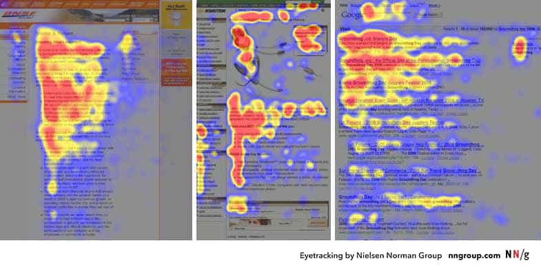
People's eyes move quickly when looking at a screen, especially when they're looking for a solution to their problem.
When people visit your website, the first thing they are going to do is read in a horizontal direction across the upper content area. This means that having a CTA button right there will boost its click rates. However, do keep in mind that placing your button above the fold might not always yield the best result because industries and landing pages do differ.
There is really no right or wrong place to position your button on the webpage. While the fold may be a good area, you may find that you have better results putting your button closer to the cover photo. You'll really just have to play around with it and find out what position works best for your business.
Help your CTA button stand out with color
Your CTA button should preferably be a color that is not white, grey, or black. Other than that, it can really be any color that stands out. There is an infinite number of color combinations, shadows, fonts, gradients, borders, etc. You can test out a plethora of different options and find out what works best for you, but here is a simple checklist to help you get started:
- Your CTA should be a color that is not black, white, or grey.
- Your CTA should stand out from the background.
- Your CTA should not clash with the background.
A lot of your CTA button design decisions will depend on your website's color scheme, existing design elements, and the color of the background.
Color is important and can actually affect the click-through rate. Marketer Matthew Woodward did an experiment to see how different colors affected the click-through rate of CTA buttons.
Woodward's original CTA was green.

He then compared his original CTA color to four other colors: blue, red, purple, and orange. All other elements on his landing page remained the same.
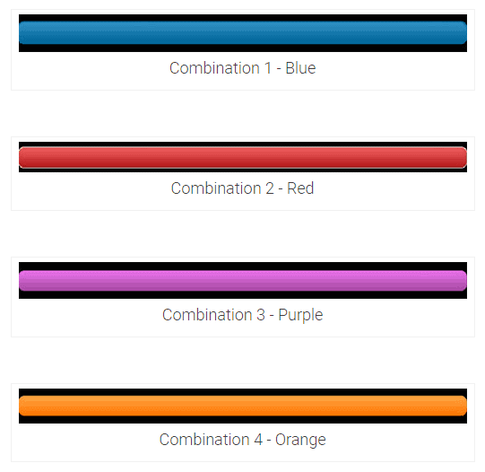
Here are the results:
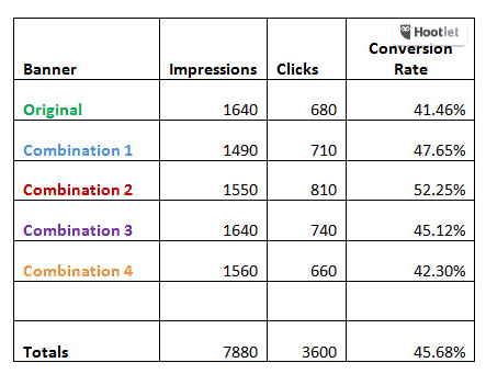
From his findings, you can see that each color variation performed better than the original. Simply by changing the color of the button, his click-through rate was able to grow by more than 10%. Experimenting with the colors of your own CTA buttons could yield the same results, the only thing you can do is test it for yourself!
Size your CTA button sensibly
Make sure the size of your button makes sense. The whole point of the button is to make people click on it, so you should make sure it's easy for them to do so. You don't want to make it too big, however, to where it looks odd or unnatural, which may actually deter people from clicking on it.
The size of your CTA button is especially important when it comes to mobile. If you create a button that is too big on a mobile device, no one will want to click on it; instead they'll probably just get annoyed by it.
Here is an example from getepic.com, a digital library for children 12 & under. As you can see, they have a button that is big enough to read and easily click on, while not obstructing any design elements or seeming too obtrusive.

Takeaway: optimize the size of your CTA buttons for both mobile and desktop versions of your page or ad. Make sure they are sized appropriately in relation to the copy and imagery being used and that they are not in the way of design elements.
If presenting options, only offer two choices
While humans may love to make choices, having too many options can quickly backfire on you. The best call-to-actions only offer the user one choice, such as subscribing or creating a free account.

However, you can also offer visitors two options in a pop-up ad. Such as this pop-up from The Krazy Coupon Lady: "Start Saving!" or "Nah, I like overspending."
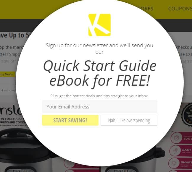
Pay attention to the way the second option is phrased, though. The second option comes across as negative, making the user uncomfortable. Everyone likes saving money, and this knowledge makes clicking the negative CTA more uncomfortable for the visitor.
Other situations in which you might see two CTAs:
- When you are targeting two different audiences, such as men and women.
- When you are offering two different plans (see the Spotify example below).
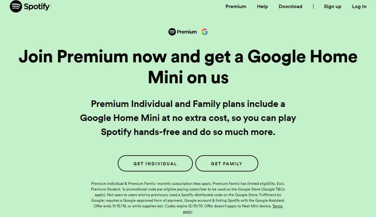
Make your CTA button look clickable
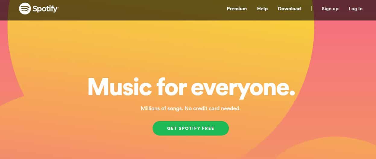
If you want your visitors to click on something, they need to know that it's clickable. Here are some basic fundamentals of buttons:
- Buttons have a rectangular shape.
- Buttons have clear borders or boundaries.
- Buttons have white space surrounding them.
- Buttons use a contrasting color.
Here's an example of how Spotify makes their button look clickable:
Use words that provoke emotion
You want to get a strong response from your audience with your CTA button. If your CTA is enthusiastic, then your audience will be too. For example, by saying, "Buy now and take 50% off!" you are not only providing them with a great benefit, but your audience will be excited to get half off their order.
For someone looking to plan their wedding, a CTA such as "Plan your dream wedding today!" will excite them about their marriage and make them that much more eager to click on your ad. A small but effective element to enthuse your audience is simply adding an exclamation point at the end.
Use FOMO as a motivator
FOMO is an acronym for "Fear of Missing Out" and is a very effective motivator. When people think they might be losing out on an opportunity that might not come around again, they'll be quicker to hop on your bandwagon.
Some examples of this technique include "Shop now! Sale ends on Tuesday," or "Buy now while supplies last!" The FOMO technique is great to use during long weekends or the holiday season.
Use timing words
Using timing words such as "Now" and "Today" can help create a sense of urgency. If people are feeling a bit urgent, they're more likely to click on your CTA button, which accomplishes your goal!
Use Obvious Nouns
Whoever your users happen to be, there are a few words that most people like to hear, such as "Course," "Ebook," "Guide," etc.
Your button copy should explain what your audience will see or get once they click on it. For example, Amazon's buy button uses a compelling action word ("Proceed") and an obvious noun ("Checkout").
Conclusion
A button may not seem like much, but don't take the power of a CTA button for granted. This button is a gateway to increasing your sales. If you need help with generating leads and creating call-to-actions for your website, feel free to reach out to us at AnoLogix!
Let's bring the spotlight to your business today.
From brainstorming to implementation, AnoLogix has successfully designed, created, developed and implemented websites for people and businesses since 2000.
With AnoLogix your business can skyrocket. Do you want to learn how we can help?
or call us for a FREE consultation at (904) 807-8961