8 Types of CTAs Your Website Needs

What is a Call-to-Action?
A call-to-action (CTA) encourages your audience to do something, such as submitting contact information, signing up for newsletters, purchasing a product or service, or sharing your content on social media. CTAs are essential because they help businesses convert visitors into leads and leads into customers.
However, it's important to keep in mind that there's more to it than putting a big, red "Click Here" button on every page of your website where you want visitors to click. You have multiple audiences looking at your website - visitors, leads, customers, etc. - and you want each group of people to do different things. For example, you want visitors to become leads, you want leads to become customers, and you want customers to buy from and promote your business.
The solution to this is to create multiple types of effective CTAs to serve your different audiences and their goals. You don't need to go crazy with making a ton of CTAs, though. In reality, there are only a few CTAs you need on your website when you first start out.
As your business grows and your website becomes more involved, you may need to switch some CTAs up, but below we have some great CTAs for you to take off with.
Lead Generation
Call-to-actions are essential in generating leads from your website. Since you're trying to convert visitors into leads, you'll want to place these CTAs in any spot on your website where you have a high percentage of new visitors.
One of the most popular places to put these types CTAs is on your blog - either at the end of the post, as a floating banner, or in the sidebar. Your CTAs should be able to clearly communicate the value of clicking on them and what the visitor should expect when they get to the landing page that the CTA directs to.
Here's an example of an effective lead generation CTA:

Form Submissions
Once your visitors reach your landing page, they'll need to do two more things before successfully becoming a lead: fill out a submission form, and hit the "Submit" button to enter their information into your contact database.
Now that your visitors are on the page you've guided them to, they're so close to actually becoming leads. Don't let them slip through your fingers! Trade out the "Submit" button with something more specific or actionable, and make it specific to what they are filling the form out for.
For example, if your visitor is entering their information for a guide, instead of "Submit" use "Download Your Guide." Or, if your visitor is scheduling an appointment use, "Schedule Your Appointment."
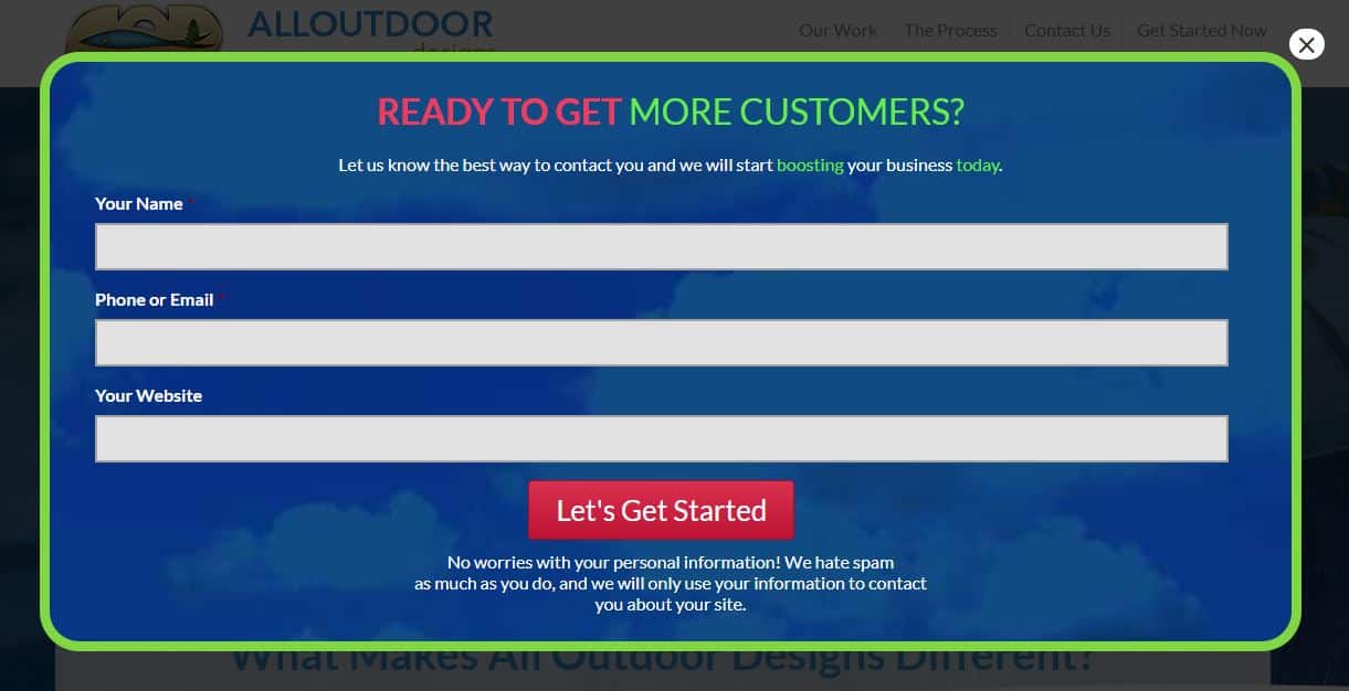
Below is an example of All Outdoor Designs using a more engaging and actionable "submit" button to complete their form.

"Read More" / "Learn More" Button
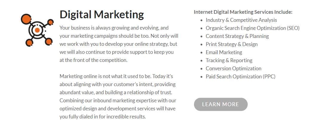
Anywhere you display a feed of content, such as your blog, press newsroom, or customer case study page, you probably won't want to display the entire post on the home page. This is a great time to entice your viewers to click on individual posts by featuring the first few sentences or paragraphs of your content followed by a "Read More" or "Learn More" CTA.
Here's an example of what it looks like:

Not only does this allow more content to be featured on the page feed, but the "Learn More" buttons make sure your engaging posts get the attention they deserve. CTA buttons make people click through to read posts rather than just scrolling down through the whole page, ensuring that the post itself gets credited with its own traffic.
Social Sharing
This is one of the simplest types of call-to-actions, and it encourages people to share a piece of content with their friends. Social sharing buttons are low-commitment and allow all of your audiences (from leads to customers) to engage with your brand. Make sure you include these buttons in places of your website that make sense, such as blog posts and landing pages.
Don't go overboard and just put social sharing buttons everywhere, though. For example, you won't want to put them in places where people are sharing their personal information with you.
One of the best aspects of this type of CTA is that it's really easy to customize.
There are three main types of social sharing CTAS:
- Social Icons
- Social Shares
- In-line Sharing
Social Icons
If people like what you have to offer, they'll probably be looking for your social media pages as well, so you'll want to make sure to link to them from your website.
Typically, you want people to come to your website from social media, rather than the other way around, but you should keep these social icons on your page for people who want them. A great place to put them is in your footer or header.
Example 1:

Example 2:

Example 3:

Social Shares
Social shares on the sidebar of posts are great for promoting sharing and providing social proof for your articles.

In-Line Shares
If you have compelling quotes or images in your blog posts that you think might do well on social media, you might consider adding a "Click to Share" button to promote social shares.
Newsletter Subscriptions
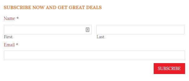
Newsletters are an essential part of your business's website, but they have to be done well if you want them to be effective. Newsletters provide readers with periodic updates, promotions, events, and news but they are also a way for your business to generate new leads.
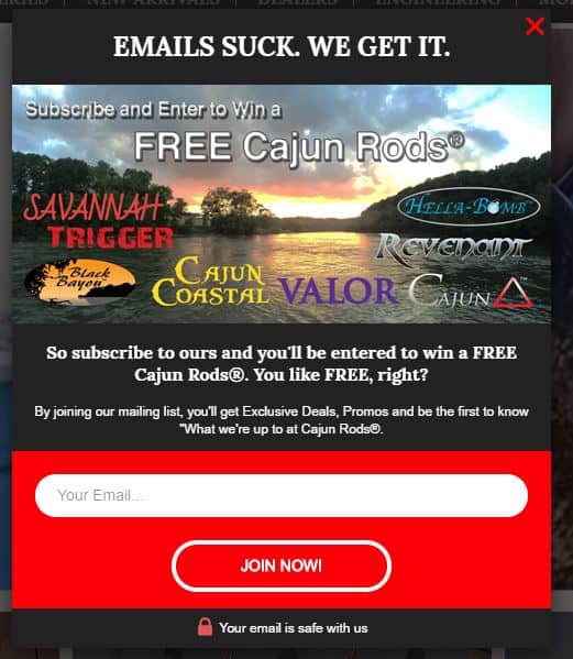
You can put an option to subscribe to your newsletters in your footer, or you can use an eye-catching pop-up. Here are some examples:


Since people get tons of emails each day, they might be hesitant to sign up for yet another. You can incentivize these people by offering them exclusive deals or extra content they might not get otherwise.
Event Promotions
If you are hosting an event (online or in-person), you are no doubt wanting to get lots of people to attend. Use an event promotion CTA to make people aware of your event and drive up those ticket sales.
One of the best parts about this CTA is that there are so many places you can put it, depending on what segment of your audience you are trying to get to attend. For leads, you could put this CTA in your blog sidebar. For customers, you could make it appear on their dashboard, login page, or even on a receipt page after they've made a purchase.
Nurture Leads
What about the people who have become a lead but aren't sure about paying for your services quite yet? You'll have to entice these people with a different type of offer - one that is more aligned with the product or service you're offering rather than a generic marketing funnel offer.
Consider offering product demonstrations, free quotes, or free trials with a lead nurturing call-to-action. Put these CTAs in places that a lot of leads visit, such as in a blog post or at the bottom of another marketing offer's thank you page.
Here's an example:

Convert Leads into Customers
Once you're done with lead generation and lead nurturing, you want to get right into converting those leads into customers. These conversion CTAs will be centered around sales because you want these potential customers to buy your product or service here and now.
If you have smart CTAs, you can use them at the end of blog posts, but you can also place them on product pages in case your potential customers want to do any last-minute research before making a commitment.

Conclusion
The types of CTAs you end up using will depend on your website's goals. But no matter what type of website you have, you'll definitely want to use a mix of different CTAs for different purposes, whether it be to entice people to read more about something, share something, or buy something.
Remember, CTAs are essential for turning visitors into leads, leads into customers, and customers into promoters. Make sure your CTAs are clear, easy to locate, and that they offer something valuable to your audience.
Let's bring the spotlight to your business today.
From brainstorming to implementation, AnoLogix has successfully designed, created, developed and implemented websites for people and businesses since 2000.
With AnoLogix your business can skyrocket. Do you want to learn how we can help?
or call us for a FREE consultation at (904) 807-8961