10 Additional Ways For Successfully Boosting Conversion Rates

Introduction
In the previous post, we covered 10 ways for increasing your conversion rates for both desktop and mobile sites: Using a CRO planner, condensing your forms, providing social proof, observing visitor engagement, including live chat, verifying offers, performing A/B tests, strengthening trust and eliminating friction, developing abandoned cart campaigns, and declaring your value proposition.
This post will delve deeper, with 10 more strategies to boost conversion rates.
1. Integrate multimedia elements with your web page
Has there ever been a time when your order arrived, but with a totally different appearance than you anticipated?
This confusion shouldn't happen when visitors take advantage of your downloadable offers. Add image and video content on your page regarding your goods or services to prevent this conflict.
Integrating multimedia elements will present your website as more reliable. Multimedia is also the ideal means for taking in content.
To increase your site's conversion rate, add graph and chart images or glowing video testimonials to your website.
2. Compose solid calls to action (CTAs)
A large element of conversion is your CTA. This CTA might be a downloadable offer, a social media post, or email newsletter subscription.
No matter your offer, your website pages should be filled with CTAs. This typically means that your CTAs will be apparent and easy to access. However, there must be a perfect balance, as too many CTAs could make your website appear spammy.
Usually, a landing page has only one CTA offer but will have several instances of it on a web page. For instance, a web page can have one CTA as a popup, a second CTA within the text, and another CTA at the bottom of the page.
In most cases, the earlier your CTA appears to visitors, the better. If not, you risk your audience not scrolling down the page enough, completely missing your CTA.
What's crucial to consider is that your CTA is accessible no matter where the reader is on your page. Eliminating your audience's risk, such as providing a guarantee and conveying a clear message in your CTA, will motivate them to take action.
3. Remove needless distractions
In presenting your CTA, it's vital to omit anything from your site that might prevent your visitors from making the preferred action. Remove all popups, needless links, or navigation that might distract a visitor's attention.
A too busy or overly cluttered page will be less apt for converting your visitors. You only have seconds for winning over your audience, and a site that's difficult to navigate will dissuade them from staying to shop.
Use a page design that invites your visitors to engage with your CTA, taking advantage of visual hierarchy.
4. Fulfill your visitor expectations
After a visitor clicks through, in response to your search engine meta description or internet search ad, your webpage should fulfill those promises made. Solutions given in the meta description or ad need to match what your webpage copy says.
But if your webpage neglects to deliver on what your audience expected to receive, they'll fail to convert. For this reason, you must consider the whole customer process, from the moment they see your ad, go to your site, and download your offer.
If your landing page isn't bringing conversions, examine your social media posts and internet search descriptions to ensure you're following through on your promises.
5. Enhance your mobile page speed
For mobile conversions, a big deterrent is slow page speed, which means the amount of time your page takes to show on the mobile screen.
With 40% of users abandoning sites taking longer than three seconds to load, even a one-second lag could bring a 7% conversion reduction.
Should you discover your mobile site isn't bringing optimal conversion, test its speed with PageSpeed tools by Google.
For improving page speed, make your images smaller and more compressed. In addition, you should have a responsive website optimized for mobile devices.
6. Optimize your site for mobile
Due to Google's switch to mobile-first indexing, the importance of mobile optimization has increased. Your site's Google ranking could become impaired without mobile optimization, lowering conversions.
So, how do you optimize for mobile? First, realize there are differences between desktop and mobile experiences. Using Google's mobile testing tool, you can check if your website is mobile-responsive. This tool will also give you suggestions on ways to enhance the performance of your mobile site.
For example, your mobile site could require a larger font for better legibility. Or the images might need to be compressed for better loading. Or your page speed might need improvement.
7. Upgrade the ordering process
Online purchases via smartphone should be a straightforward procedure. Shoppers shouldn't have to go through numerous steps for checkout. Payment buttons should be prominent and simple to use. It's best for character limits to be removed from payment information forms. Otherwise, mobile users may be unable to complete all their information.
Purchasers should have an option to check out without a registration requirement. They should have a choice of payment options besides credit or debit cards, such as PayPal, Apple Pay, or Google Pay. In the end, the procedure should be seamless and without friction. A difficult checkout procedure for mobile devices will decrease conversions.
8. Show creativity in mobile marketing
Your strategy to boost your mobile conversion rate shouldn't be limited to just optimizing your website for mobile devices. You should also show innovation and launch marketing campaigns targeted only for mobile. As an example, you could run campaigns that channel SMS text messaging, or target customers with push notifications if your brand has an app. Creative ideas such as these can assist in increasing your mobile conversions.
9. Modify your site for mobile
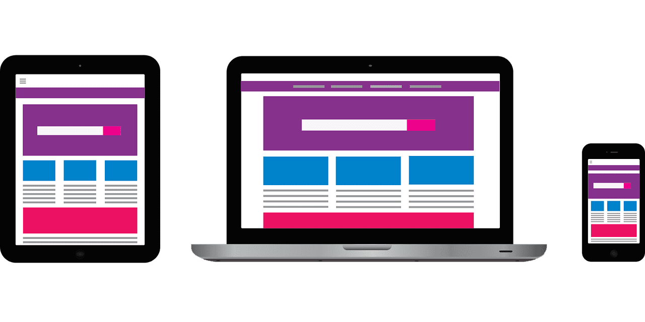
Due to differences in the desktop and mobile user experiences, websites for each should also differ.
Your form for email subscriptions might appear smaller on mobile or entirely nonexistent. In addition, you might implement different types of CTAs for mobile, despite the offers being the same. Your mobile site benefits through minimalism and simplicity, with the removal of any distraction. Allow your site to have simple navigation, such as using a hamburger menu.
10. Target local content
Visitors using mobile devices to access your site typically do so for learning your location and contact information, getting directions, or reading your reviews. For this reason, you should refine your site for local business. This involves displaying your location on your webpage, upkeeping your online business listings, and developing content for a local audience.
For increasing your mobile conversions, explore making your content local to improve your local search performance.
Conclusion
Mobile CRO strategies can be applied for desktop audiences as well. But no matter which device your audience uses, you should always seek the bigger picture by focusing your campaign on your customers' viewpoint. If you were your own customer, what incentives would encourage you to make a purchase from your site and bring a conversion?
Let's bring the spotlight to your business today.
From brainstorming to implementation, AnoLogix has successfully designed, created, developed and implemented websites for people and businesses since 2000.
With AnoLogix your business can skyrocket. Do you want to learn how we can help?
or call us for a FREE consultation at (904) 807-8961